Discourse is a discussion platform that we are using
Feel free to say your feelings and your feeback.
The web interface seems quite confusing at the first glance… The creators say using it should be the best way to learn it.
It might be, because it’s not like a common forum. But I can ensure you that is very easy to use after the first glance
initially it’ s really tricky
@AbsyntH which part is tricky? This cheat-sheet could help? We can improve it
You don’t have to choose a category at first, just post and choose the category after that
it’s “tricky” if you think at Discourse like an “old” Forum,but more you use it and more it become friendly
The UI is quite flat, I mean, every page/section appears the same.
What is strange is that from mobile devices it’s a better experience.
However day by day things goes better.
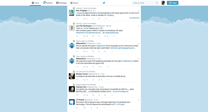
You might be right, but if you think about it, Facebook or Twitter or G+ are very similar
As I said here
Discourse is not like other forum, almost it’s not a forum but something else. It’s something that looks like a social network, a forum, a chat or a mailing list. It could be confusing at glance but indeed it’s very easy
@sitz do you like smothing like that? With more contrast among rows and use of borders?
mmhh… IMHO UI si not so clear… I’m referring to a topic… too much white and empty space… is there any other temlate we can use/test?
Which part? Do you refer at the topic or at topic list? Do you want more colours? ![]()
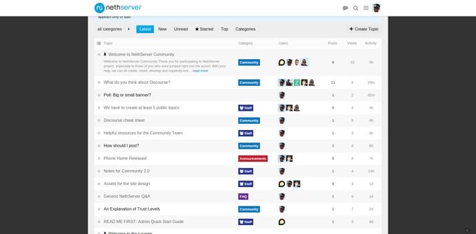
Do you refer to the home page? Something like this is better? Categories - NethServer Community
@zamboni Do you like it? Like NethServer official colours 
I activated it, what do you think?
No, I’m not talking about topic’s list, i’m referring to the topic’s post page, like this you are reading now…
What do you think? Is it better with the new CSS? And gray background? Can you attach an image with some example? I could ask to my CSS guy @davidep and @Stll0  to take a look
a bit better, but IMVHO we should make it more “classic forum like”… it will increase its readibility (BTW, does this word even exist?)
moreover, on a classic 15.6" laptop screen, there’s too much empty space
@zamboni zamboni Maybe because you’re used to this
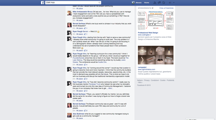
But Facebook is like this (despite the ads)
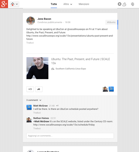
G+ is like this
And Twitter like this
Are so different from Discourse?
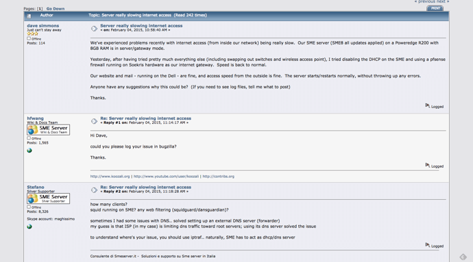
Are you sure to want go back 10 years?
are we talking about a social network site? 
about going back… maybe I’m too old (or you are too yung), but if we are talking about something that should be use for work, simpler and cleaner is, the better choice.
we should use all the available space on the screen when it’s available (pc, laptop)
moreover… I don’t use G+ or twitter, and on FB I use an add on to hide ads
I don’t want an old interface, I want to have a clean one where I can read easily the content
we don’t need a Bmw X5, but a land rover, if you know what I mean… a work tool, not a (new) social site 
all IMVHO
@alefattorini I have no hurry to change the spacing: I want to believe it has been optimized properly to depend on the size of the screen!
I agree with you and the current one is the best size for me ![]()
But we can play with colours to minimize the white.
I would leave it as is: there are too many buttons and details to look at, I would not add more.
Let’s hold on a while. I think it’s a matter of habit ![]()
