I like the Nethserver webgui.
It’s clear, It’s simple, the minimalist design is good.
But I noticed that there’s things to improve or at few to standardize.
For exemple the help button, sometime is on the upper right, other time it could be at the bottom right.
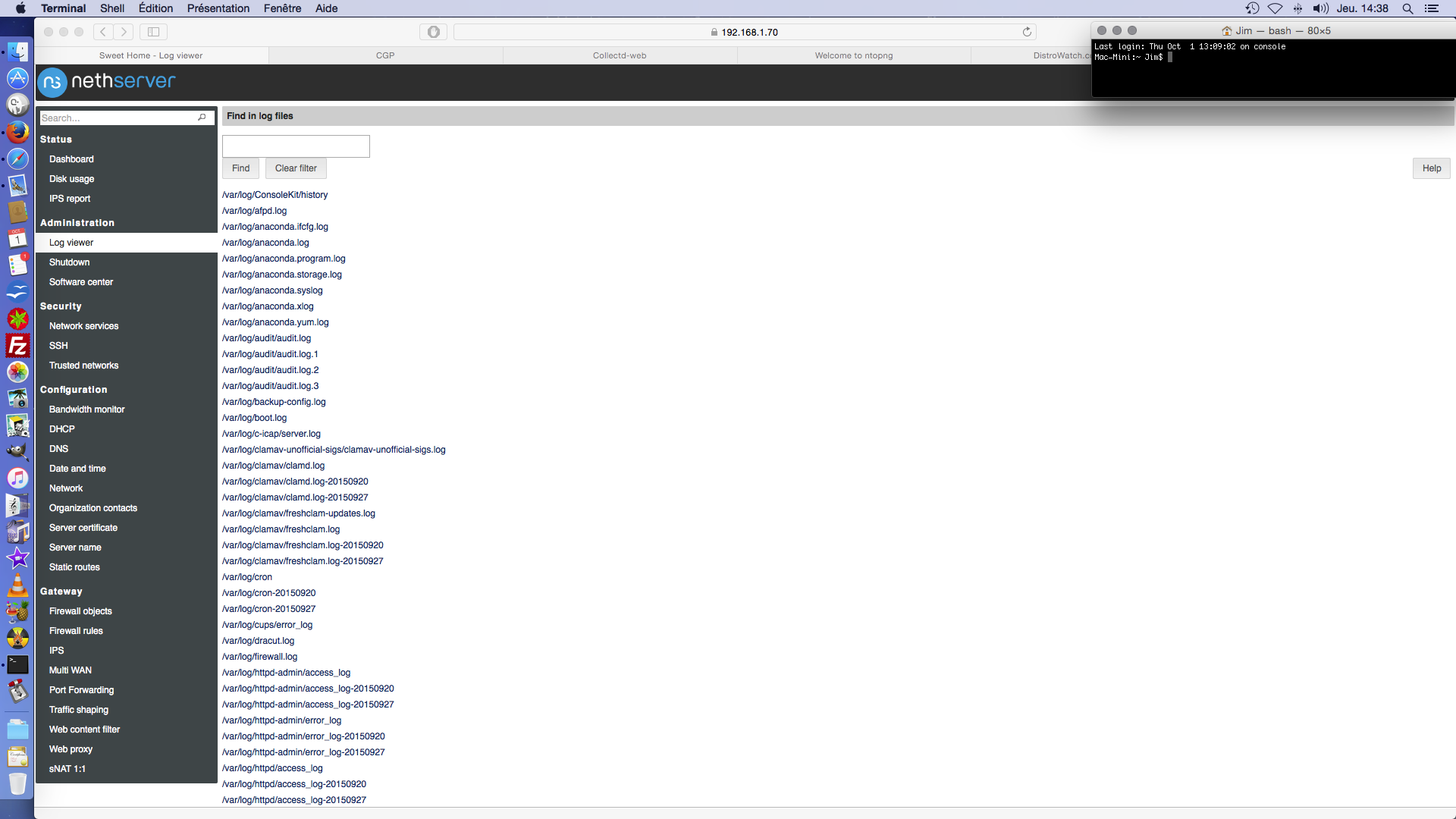
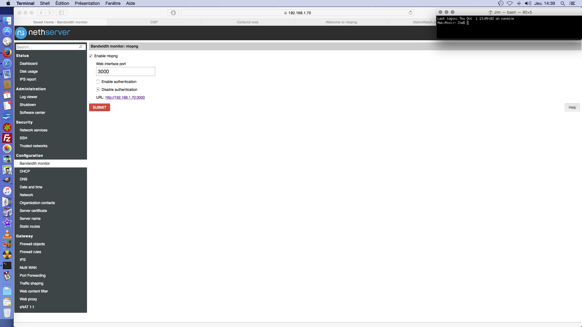
Other exemple: the Disk Usage and the IPS which are on the left menu, when ntop is in TAB in the dashboard…
Why not put the Disk occupation and the IPS menu entry in a tab too?
Why “DHCP”, “DNS”, “NETWORK” are in “configuration” and not in “Gateway”.
I don`t want to make a revolution… But I simply want to make a “brainstorm” to standardize the webgui.
Those were in a tab in a previous release, but it had the side effect of slowing down logins, so they moved to a separate page.
I agree with your observations and I’d like to polish things in a future version.
Could this thread be the place to discuss future gui design?
What do you think about standardize this webgui? for pinning this Help button
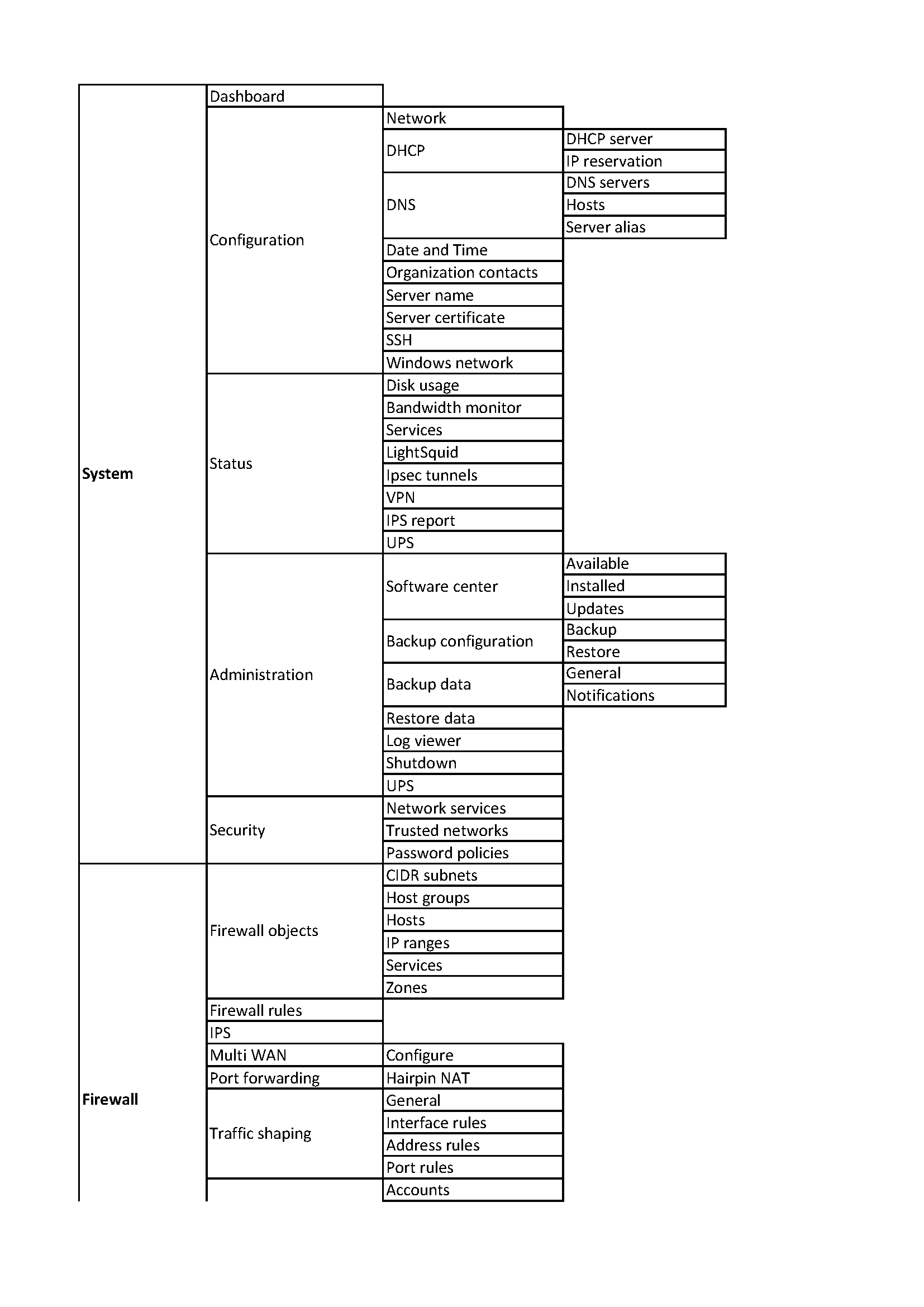
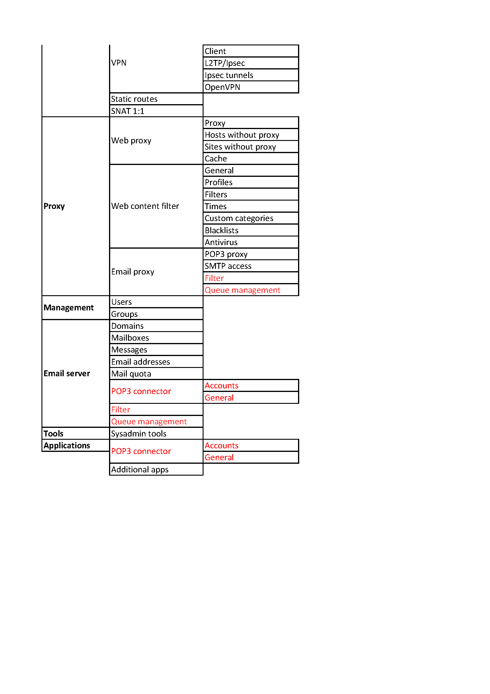
And to reoganize this left menu…
For exemple:
To group all reports and log in one item menu ( REPORTS )
To group all about local configuration ( like the servername, network interface, time…) ( LOCAL CONFIG )
To group all services, and application in SERVICES, and treat all application as a service ( Shorewall, Proxy, Owncloud, Rundcube…
4)) To group all utilities ( shellinabox, bandwidth monitor, disk usage, shutdown…) in TOOLS
Did you have a better way to organize this left menu?
Uh that’s a great work but maybe an image isn’t the best tool to co-operating together, a google spreadsheet (with blocks and rows) should suit better IMHO
My point of view based on NS 6.7 (final).
Is not the proper order. Just for grouping.
NethServer 6.7 (final) installed from scratch as AiO - VM in VirtualBox.
All updates.
I have installed everything from Software center, without Languages.
It is possible that I have missed something in UI_6.7_final.xlsx.