What about a customizable left menu?

I think a lot about the web gui and I was thinking on another way:
Is a customizable left menu could be a solution?

Nethserver is highly modular, so each one could have a different objective or task (Utm gateway or firewall gateway, or Ad server, or mail server, groupware, web server…)
So a menu like "status/system/management/gateway " coul not sweet well for someone who focus on a mail server, or owncloud/file server…

Let imagine a customizable menu with 5 self labelized categories or “slots” and a sixth category labeled “uncategorized”, where all fresh modules items go by default.
And left each one reorganize it’s own way the menu.

Not sure to be very clear but to resume: With Nethserver which is highly modular, a customizable left menu could be a good diferencial feature.

2 Likes

Please, could you make some mockups?

Heu… Yes, I can. :laughing:

Here a draft to explain the concept.

By default there’s four categories ( or more? )with label “1 - - - -, 2 - - - -, 3 - - - -, 4 - - - - and Uncagorized” to show the menu.

Labels 1 - - - - , 2 - - - -, 3 - - - - and 4 - - - - are totally customizable.

When Uncategorized is empty, it will be hide.
When labels 1 - - - -, 2 - - - - are deleted, hide the category too, and find a mecanisme to show again when need.

I’m not sure I understood your proposal.

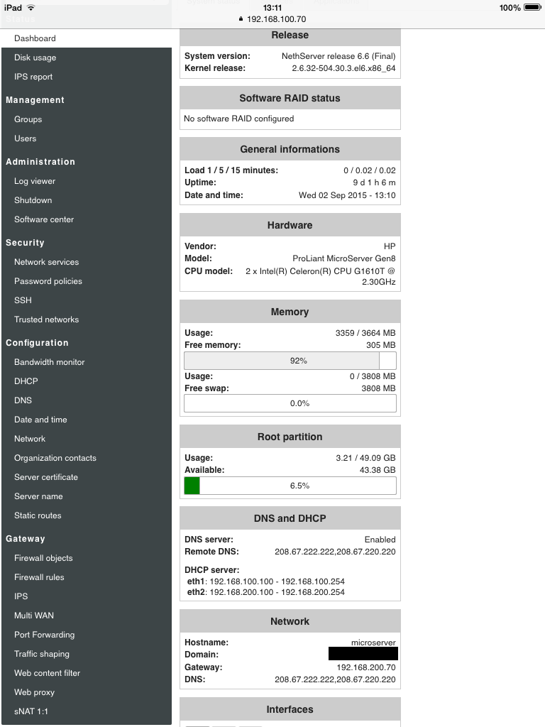
By now, the left menu has a search box and varies depending on what modules are installed.

IMHO allowing the left menu customization is a double-edged sword. Having different screenshots from users does not ease the documentation and support team job.

Moreover, the UI does not persist the view state at this moment. Developing a persistent view would require a non-trivial effort.

Not sure It will be more complicated for documentation.

If a doc is about the web proxy filter, is not really matter where is the module can be found, like you already said, there`s a search bar.

What don’t you understand ? Perhaps I can explain a little more :smile:
Or you said that I`m writing like a pig :grimacing:

Why not? Where is the problem. If you’re using a mail server and firewall modules aren’t installed you can’t view the gateway section for example.

There`s not a BIG problem.
Just the sensation that this menu could be better organized.
For exemple, this is a print screen of mne:

For me, the categories Management / administration / security / Configuration can be in only one category System or local configuration.

Few items of theses categories could be in Status, like the log viewer, banbwith monitor

Others items, like trusted network and static route should be in Gateway

Think there was a good reason for this choice, maybe @davidep or @giacomo could explain it better than me

IIRC the categories are inspired by the SME Server interface

1 Like

Is it open to talk about reorganize or to be able to customize this menu?

Or, for now, it’s not woth? Or it’s not a priority?.. Or exept me, anybody is interesting?

I would be very surprised if a single member of this great community wasn’t interested in the look, feel and functionality of the GUI.

I know it’s wrong but a lot of people prefer style over substance. The GUI is where you spend 90+ % of your time.

As the project grows it will be the screen shots of the GUI that people will see in blogs, magazines and websites.

A logical, well organised GUI will really help drive more users to NS.

3 Likes

When I give a try to Nethserver, i like the webgui, the design and the minimalism, the good interaction with the ipad was another very good point.

But, with my background ( ClearOS / Pfsense / EdgeOS ) and other projects of interest like Opnsense.
I found the menu could be better organized. With these projects, it’s seem like there’s other logic to organize things like Configuration / Status or monitoring / diagnostics or reporting tools )

In the Nethserver left menu, items seem scattered like the bandwith monitor is in category, the log viewer in another category, the IPS report in another yet, the ntop tool in a tab in the dashboard…

I mostly agree, but I rather prefer to maintain the Security category to focus the user attention.

I don’t like very much the actual menu organization so I’m fully open to any improvements.

3 Likes

I don’t like customize labels or categories but I could mostly agree with a new default structure. Actually I’m a fan of the search box on the top :smile:

Agreed, working on GUI could seem bikeshedding actually not. Making good improvements could help as you said feel and functionality.