I believe NS needs an even fresher GUI. Cockpit is indeed nicer than NethGUI, but also seems way less “fresh” than Zentyal’s interface. One important thing this is done wrong in Cockpit, is that the tree is “unbalanced”. (which is GUI Design 101) The first branches have many subbrances, while the rest don’t have… any. So why not be in some some-branch too?
I think it really needs to be re-evaluated before made the default.
Even worse, are some features that are completely out of place (I don’t have it in front of my right now, but I think smarthost is an example?).
I hope Cockpit is “extendable”, as many modules need to find a way to be configured within it (SOGo already mentioned in a support thread).
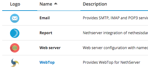
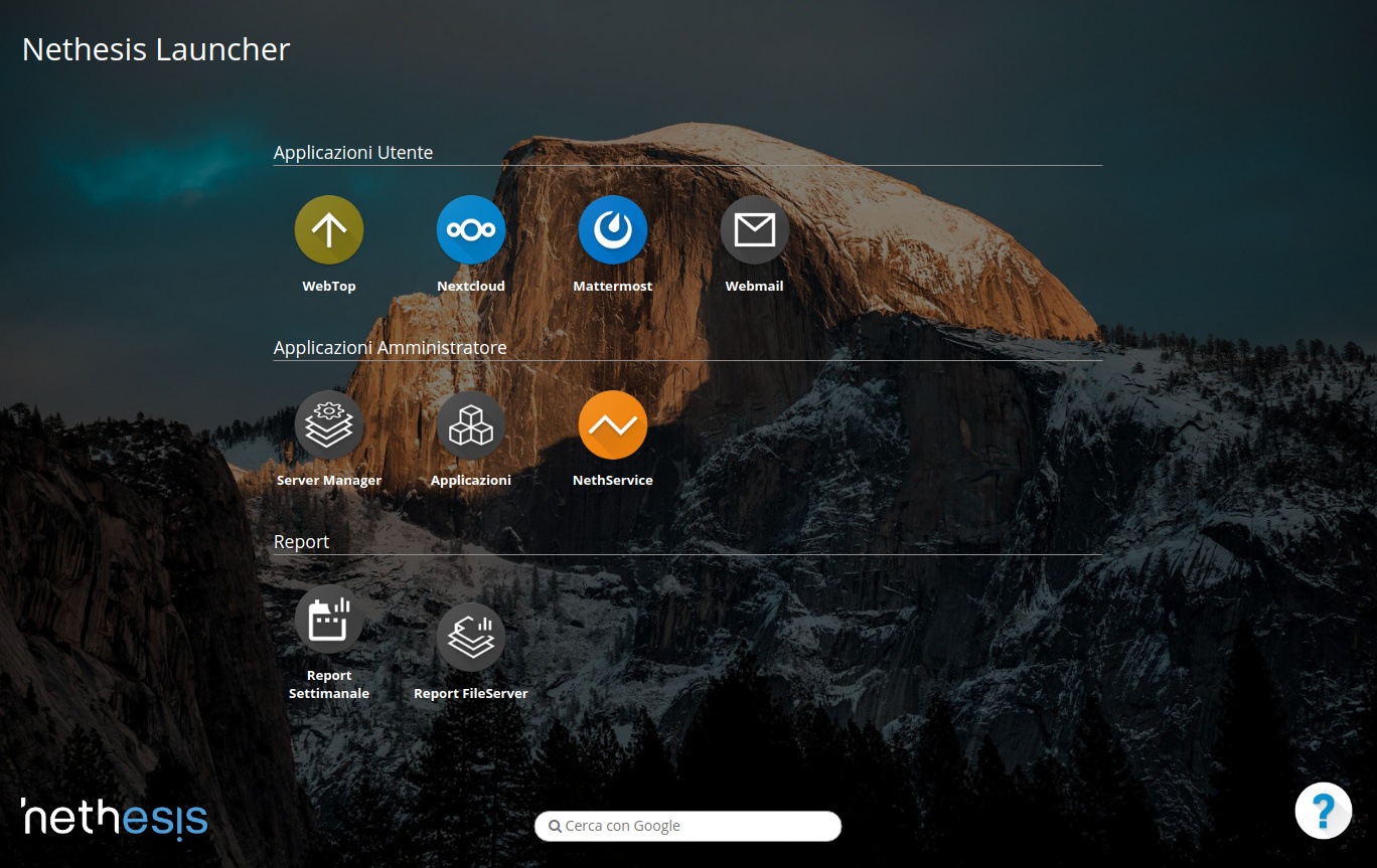
Even in the list of active modules (calling them “applications” -yikes- for the smartphone generation), the “email” label, should be clickable and send you to any active webmail. Like mattermost takes you to actual mattermost. These things need to be more intuitive.
Disclaimer part:
I actually evaluated several solutions (in VMs) and I found the strongest competitor to be Zentyal.
I hope this is not taken wrong, but here are my feelings about how NS could be improved. I.e. my list of things missing (and needed) that ARE available in Zentyal. Not a complete list, just what I believe is vital.
NOTE! My comparison between the two systems, also includes MANY positive things for NS. Thing is, positive things are not helping to improve a product.  So I may list those in some other thread (or in my blog), not here. I am not bashing NS in any way. Actually I am heavily leaning towards NS for my home server (within an unRAID VM), this is why I post here what I think should be in. As it is “closer” than other “finalist” Zentyal, to what I need already.
Really hope some of these things do get implemented eventually.