Hi all,
in Webtop when using my 14”laptop, I am always struggeling with deviding the interface between the list of mails (top) or the preview (bottom). Either way, to me it feels like not fitting.
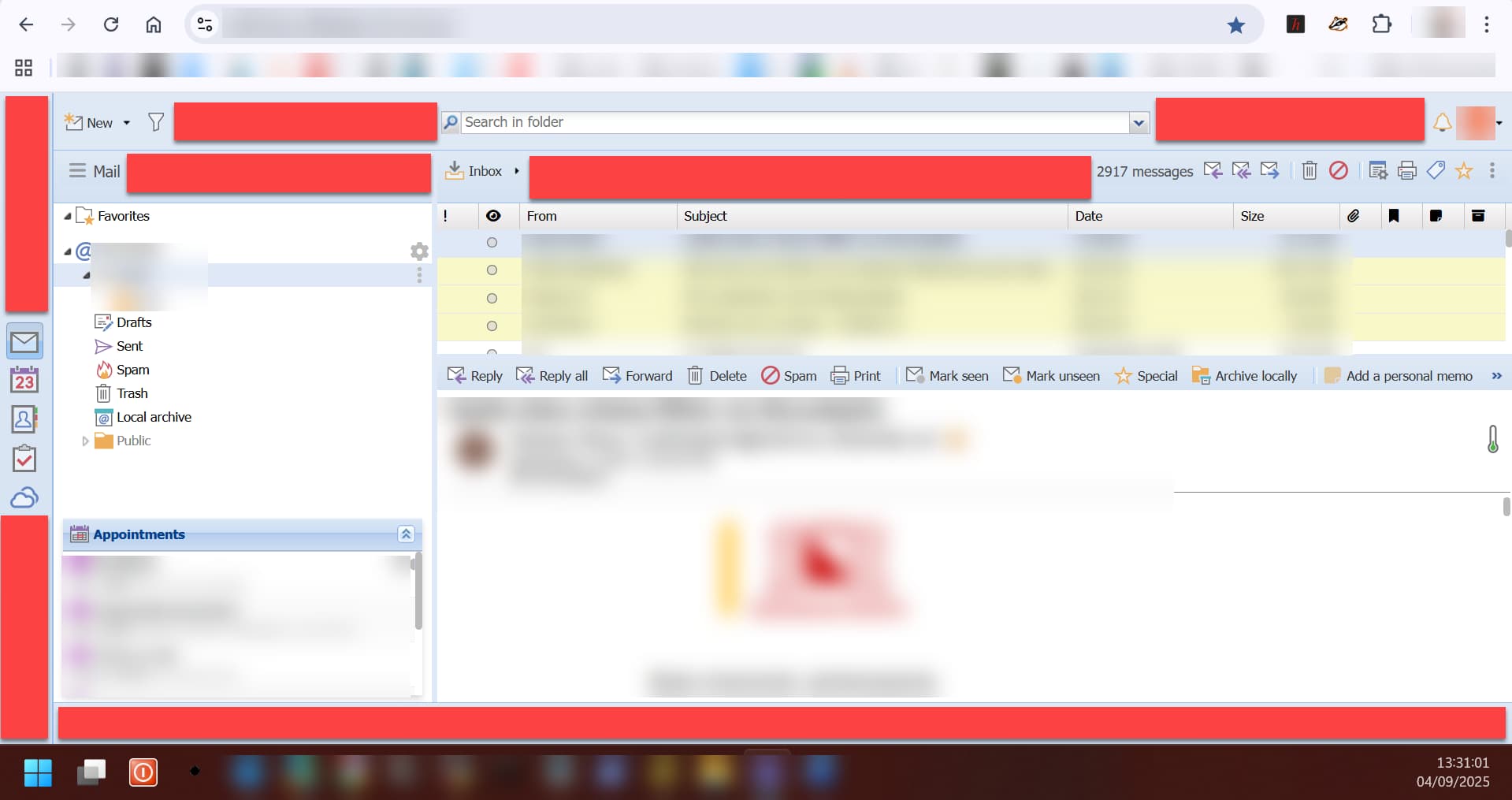
But upon looking at the interface, I notice lots of wasted space, blank spots, that (IMO) can be used more ‘economically’. See screenshot: all red bars are empty space.
Couldn’t there be a layout provided that is more suitable for small screens? Compress screen-items into the now empty space?
We’re aware that on smaller screens WebTop can feel a bit too “spacious” and not always easy to use. We actually explored ideas like a more compact layout, but we’re still looking for a good alternative.
Probably you already know this, but in the meantime a quick workaround is adjusting the zoom level. On Windows the system zoom is often set by default to +125%, so you may want to check that and reduce it (though this affects everything, of course). Or more simply, you can adjust the browser zoom from the settings or with the usual shortcut Ctrl -.