Some Nethgui inconsistencies

Hello,

I would like to point few things that are not important, it’s purely cosmetic, but It’s in details than we can see all the quality of a product, or software…

The new look of the Nethgui is beautiful but I already saw few inconsistencies:
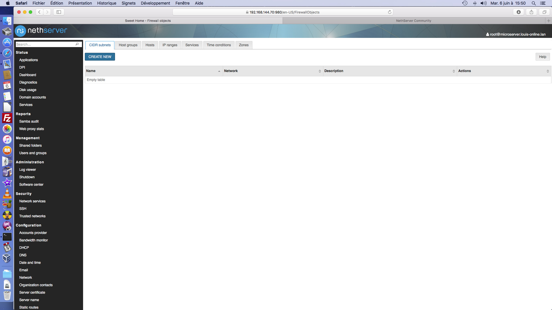
The new look of tabulation are like this ( the tab bar CIDR subnets, Hosts groups…)

In the "configuration Network… the “tab bar” is looking different !!!

Worst yet… When clicking on one of these tabs, we loose the tab bar !!!

What are yours thoughts about this?

3 Likes

You’re right, but it’s a good shot.

I’m fully with you.

3 Likes

One another inconsistency, in the Port Forwarding:

1 Like

Well, it looks different because it’s not a tabs bar, it’s a list of buttons.

Maybe the problem is they look too similar :grin:

Partial off topic…responsive design (for mobile administration) ?

1 Like

Oh… yes :blush:

In the “port forward” I can agree…

In the “configuration network” it’s more confusing…

1 Like

It should already work :wink:

2 Likes