Hi all,
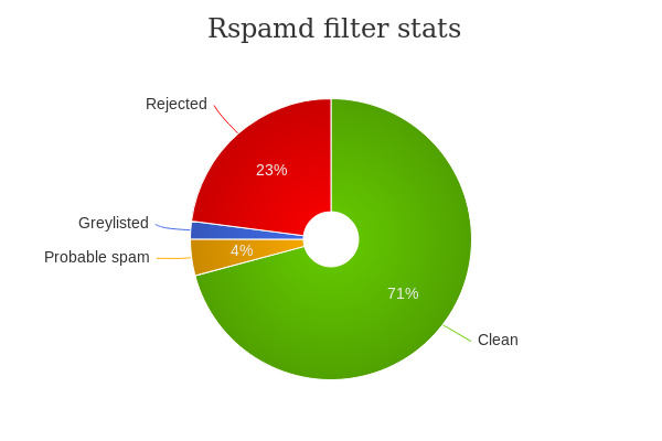
IMO Counting graylisted mails should not be included in the pie chart in the rspamd dashboard.
Since then those emails end up in one of the other categories (rejected, probable spam,clean) they are now counted at least 2 times.
The nice thing would be that, by clicking on one of the other slices, it would be divided into two, showing how many of those emails have been graylistated and how many have not to the first shot.