NethServer Breakdown from Community Experts

I’m used to being active in a community of community managers, recently they proposed a breakdown

I suddenly submitted us and these are their “picky” advice ( we earned a good A- :slight_smile: thanks to all of you )
I’m eager to get your thoughts, especially from @Jim @robb @vhinzsanchez @apradoc @dnutan
I will keep it to myself for now, so as not to steer the conversation here

https://experts.feverbee.com/t/weekly-breakdown-nethserver/3028

6 Likes

Hi,

Thanks for sharing :slight_smile:

Increasing your base font size and (min 14 but ideally 16), changing
from black on white to dark grey on light grey, and decreasing your
line length (~60 characters) will greatly increase readability. At the
moment it’s pretty dense.

I usually use 13 in font size, I think 14 can be well, bigger certainly not.
Bigger font and decreasing the line lenght…:confounded: The page will be much more bigger, and finally seem longer.

Suggestion try the font size to 13 or 14 only, and test with various resolution ( tablet ; 1024*768, larger screen ).
Finally, it’s not a question of font size, when it’s depend on the screen size, justification… It’s not a recipe. The result must be well renderized. Only trying to test your feeling :wink:

I’d consider changing the log in/sign up buttons in the header to a
different colour. At the moment everything (including your logo) is blue
and white, so those CTAs don’t stand out at all, and are upstaged by
the Latest/Categories/Top links.

The joinng page on Feverbee don’t respect this advice… :smile_cat:

Edit: Did you show them the page with categories?

Edit 2: Drop the wiki… :scream:
I know tha fill the wiki can be boring, but the actual NethServer Doc don’t cover all.

  • I’m thinking about different type of installation.
  • It lack lot of stuff, but drop the wiki is not the solution…
3 Likes

Hi @Jim :slight_smile:
This article does a great job of outlining the benefits of a bigger base font size.
Of course, it always comes down to personal preference, but if you want to design for accessibility and maximum readability, then the guideline is a good one.

You’re right – our site is a work in progress. Check back next month! :slight_smile:

3 Likes

All human works are perfectible… Are “work in progress”… Don’t worry for what I said about Feverbee.
I did’nt want to offend🙏
All I already said here is “improve, improve and improve get”

1 Like

You didn’t offend me. :slight_smile:

1 Like

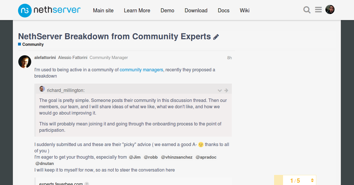
Hi my tribe! … I want to be brief

Hi Sara! it is difficult to someone getting offended in this tribe!

or that someone fool!! …

which I appreciated. It made me feel guilty though, because I’m an imposter that knows nothing about Linux.

:fearful: and hurt his feelings… :sob:crushing the dreams of the community!!

##I was joking! :joy::joy::smiley:
Now seriously I think your arrival to this village is very valuable and important to achieve that all the knowledge that here we grow, with this strange emotion that we devote, may be available to be released even in an accessible way.

Yes, it does! :heart_eyes:

The +16px recommended, we’ve been getting used to it. In addition they can go on other drives that are better suited to the device (rem, vw, etc.)

The accessibility of the content positioned very well to the community, it has very good demand in research and also in business. In the technology communities of America, we share knowledge with people living with different disabilities and are usually the more entrepreneurial.

The range of colors … of Course! you can soften to our retinas eye not feel like fried eggs. The site of Nethserver, with the “pint” that is, caught me from the beginning … not sure if it was the subliminal formula colour of Pepsi! … :musical_score: @Alessia :musical_note: yuju! :wave:

I played with the color and the font size and made some - ugly - screenshots, maybe very darkened but with the intention of getting closer to a new view. It is not a proposal

With regard to the Wiki, :neutral_face: we are doing an important job, where the writing natural of each participant is present, :expressionless: far from a language institution.

This is being carried out to the extent of our possibilities, with the thrill collective to help us :two_men_holding_hands::couple::two_men_holding_hands:, providing security for the beginner user of encounter information in short articles, so more specific and simple. It also allows us to participate in a manner more free than getting in the user manuals.

It is not a topic to which we made reference right now, but we find it very gratifying to know that we have a local interested in the same thing, in the same city, country neighbour or on the other side of the world. :flag_it: :flag_de: :flag_fr: With this information we fed discussions to overcome our language barriers, for which we consider an important data.

That pleasant meeting!. To the middle of the night, sipping coffee venezuelan :coffee: sweetened with stevia.

We must expand on the topic of social networks and many others. Obviously sometimes we cannot be so subjective, but other times it is the secret of success: the details.

Thanks Alessio for sharing this information.
I congratulate you for taking out the best rating!: +A

You Are the Shaman of the Tribe Nethserver

Thanks again @sh00001 and @Richard_Millington.
Always welcome

6 Likes

I’d like to mention here a great quote by @robb

We’re a phalanx my Spartans!

http://community.nethserver.org/uploads/db8506/original/2X/a/adcfad74c7e77f209e9aa9d80647b6c90d367957.png

5 Likes

First of all, I don’t dislike discourse as it is. I appreciate it does not get into our way. Even if nothing stands out it feels uncluttered and comfortable. But as all in life, can be improved. The thoughts from the feverbee crew are highly appreciated!

Some interactive elements don’t show off its condition (links seem static, topic rows could be highlighted on hover…)

I think tags could be more useful but are rarely used. The tags page is unpleasant.

Header:

  • change background-color: it can be considered, but…
  • the header should be homogeneous with the rest of the site.
  • Expand hover area of nav items.
  • Apply some kerning and a slight hover effect on navigation items (text color change, background-color change, or a colorful top or bottom-border…)
    Being nitpicky: what nav item is under the cursor?

Body content:

  • Agree with changing text to dark grey.
  • maybe increase line spacing a bit.
  • Font-size: now is set to 14px and a line takes ~120 characters. Increasing font to 16px will make lines shorter (~90). 80-90 per line is a good trade off IMO. OK on wide screens but feels too big on low resolutions (less than and up to 1024x768, on desktops). Therefore better if the text scales accordingly.

Having short line length, bigger fonts and line-spacing is common on blogs; on forums the text tends to be shorter with a lot of whitespace surrounding it, so it does not feel dense (there are some exceptions, like using large blocks of text when not being concise enough :blush:, or when writing how-tos).

Sign Up

  • I will remove name and country fields, or made them optional (concerns privacy). Let user fill them on the profile. Knowing the country is useful to build up translation teams and some other things, but I’d let the user decide what to share.
  • I like the one from flarum.org (a discourse-like community interface):

Blog
Good point:

I’d love to see more integration with the blog too.

Wiki

  • Agree: First it needs more content, then some organization.
  • It needs some make-up (i.e. i’d like a better sizing, spacing and decoration for headlines).
  • I won’t remove it. We could add a note telling people to get involved, a request for help.

I suscribe all what @robb said.

Had this bookmarked: web design repo / rrrepo webdesign. Just want to highlight a couple of links: fonts and user interface

4 Likes

:heart_eyes:

@alefattorini, you already change the font size… It’s really big now

Wait 25 more years… When I will have near 70, perhaps the size will be good :grin:

It’s 16px now. Just a test. Does it look better?

1 Like

No, 16 Px it too big.
Let’s try 13 and 14 Px

And look this screenshot, there’s something wrong with size, in the right side, it’s bigger yet !!!

I think 16px text body is better. It is the way to go, then other adjustments may be required too!

Finally, what is in 16 Px?

Each thread title? Or the Menu bar at the top? Something else?

Edit: I’m thinking… What’s mean accessibility for you?
It’s about ergonomics or about visual disabilitty?

To help investigations:
In the Discourse main page…

And
In a thread…

Good luck

Rendering at 90%

Rendering at 100%

Personnally, I prefer the first screenshot, the 16 Px at 90% ( between 13 and 14 px ) than the 16px at 100%.
I still think that 16 px… it’s too big.

But will stop here, this subject is waste to focus only on font size :smile_cat:

Really ugly (at least on my new shiny Fedora 24) :frowning:

3 Likes

Hi! :wave:
I swear the community interface is out of my work, I’m still too young for this!:joy:
But @apradoc you’re so pretty to think that’s my idea!
Thank you! :blush:

2 Likes

I will mention in these topics because you have so much potential and creativity for the graphic design. Your opinion is very important for us

2 Likes