Continuing the chat about improving the presentation of the bar-graphs here;
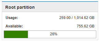
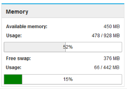
Someone may find the bar-graph misleading, or get confused by it, associating “Available :” with the graph beneath it where the 26% indicates the usage.
Do we want to improve this?
How can we improve this with minimal effort with the upcomming server-manger cockpit in mind?