We must organize the doc

I have installed a plugin concerning markdown, but I have not tested it…please go :smile:

I have set up the auth for Github and Google, we need to do it for facebook and yahoo but unfortunately I have no accounts…and no needs for them…

:wink:

@alefattorini can you send me the ‘ID client’ and the ‘Client Secret’ for FB, eventually for yahoo

EDIT : markdown seems good

I can’t see it : :neutral_face:

Github and google should be enough, but I can’t see them on Register page :worried:

Edit a page and write in markdown…no more needed.

Don’t use the register page…use the login page

Good night

1 Like

The right side is good…
But the leff… Lot of waste space in this left side menu. And the ratio between the two side is bad, too big for the left.

At least it need few adjusts

I changed from 16em to 13em, does it better ?

1 Like

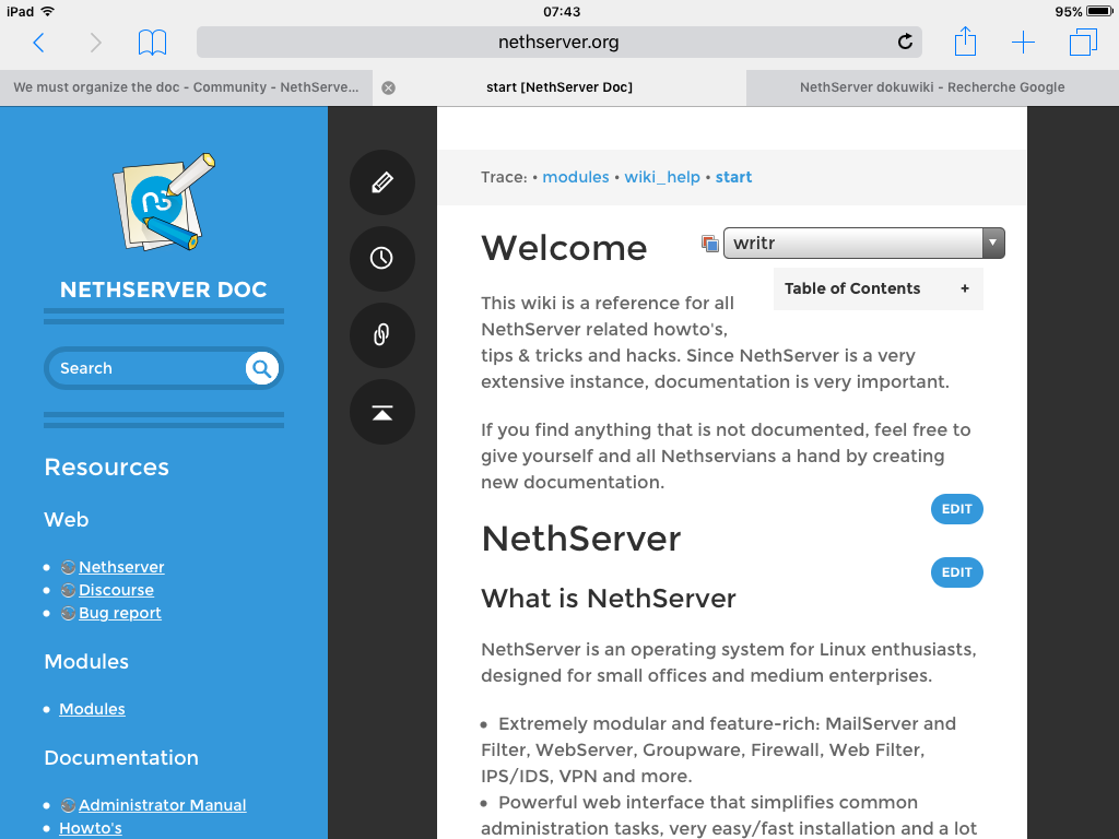
It’s better balanced…
But the vertical tool bar in the middle is still big, and the right is still tricky…
A screenshoot will show you better:

Look the dark right side

Cool! How can I test it on my profile?

Yeah! It works like a charm :smile:
Could you disable register page?

On a full HD (1920x1080) screen the right side is still a HUGE dark rectangle. Can this be adaptive to the screensize or set to a % of the screensize?

But still love the looks… For me it is a no-brainer to choose this layout…

Hi tribe. Nethserver have a style flat & angular. @Jim perhaps if we change the rounded edges …

In this sense I suggest bringing the border-radius to zero, ie remove this parameter in

.page-tools a span.icon
input[type="text"]

Look like this…

Then we can adjust the typeface, instead of Montserrat, Lato (the typeface used in Nethserver site)

Let drawing :grinning: :wink:

2 Likes

Hi @robb We can soften this view with a background color blue #AFD1EC than those referred to in the main site (Can be any other light blue)

What do you think?

Hi guys!
Great work!

I observed that in IE 11, the icons in the vertical toolbar doesn’t appear.

Also, on Windows Phone (Lumia 930, Win 8.1, Lumia Denim), the icons doesn’t appear.

It’s by me or it’s something wrong?
Can anybody else check?

Certainly that there a lot of work to adapt this template… Let’s give a try to codowik :sunglasses:

I have some worries about to modify a template…for each updates we will have to do modifications manually…but if the template is changed, it must be responsive, eg adaptive to large screen and mobile.

1 Like

well it seems not possible to disable the register menu…maybe with a trick in the template.

I took time to try the Facebook authentication with the account of my wife, unfortunately there is a bug not resolved on GH -> https://github.com/cosmocode/dokuwiki-plugin-oauth/issues/4 and thus, of course it doesn’t work.

If I cannot go to the Fossdem Allessio, it is your fault, I do know you have a FB account :S

2 Likes

No need FB account.

You can tranquilly go to Fosdem

Just wondering, how difficult would it be to create a writr-like template that is responsive and adapts to the actual width of the screen? Do we have members with HTML/CSS skills to do this?

I’m not very happy with this dokuwiki.
These little but numerous ccs problems with various templates are ennoying… to adjust, to maintain.

Finally, dokuwiki is a solution for us… or a new problem?

CSS (and templates) is just eyecandy. What you need to look at is functionality. In terms of functionality I think DokuWiki is one of the only options that has (for instance) ACL support so parts of the wiki can be used for more or less official docs and other parts can be open for the world.

Sure… But this eyecandy it’s the difference between a professional,look and amateurism look :unamused: